Reading Reference
The Design of Everyday ThingsRecommended Prerequisites
The course has a CITI training certificate due within the first two weeks of the course and it does take a lot of time to complete. Its not graded, but you have to submit the completion certificate. My advice would be start the process before the class starts. This training is required since this class deals with Human Subject Research. Further details of how to go about it can be found here.
Where are the details?
I loved the way the class is organized. Every detailed is properly catalogued in the course website. You can select your term and see the whole course plan. You can also view previous semesters for reference if your semester has not yet started. Generally this page is updated to the latest term just before the class starts.
Time Management
The summer semester has been a roller-coaster ride for this. The video lessons are amazingly informative and entertaining. They are crisp and clear and urge you to do some self reading. The time crunch arose due to the fact that there were lot of required readings (each week had 4-6 papers or chapters from books and mostly amounting to more than a 100 page per week). These were required because questions were asked from these. While this class has an open everything exam, without a previous scan it would be rather difficult to look for the answer using Ctrl+F. The questions are worded in a way to deter direct search - both in the readings and the internet. Apart from that, assignments (6-8 pages) were due everyday and one of the ways to earn participation was peer feedback. So overall, it was overwhelming. This probably will not be the case for Fall and Spring terms.
In terms of difficulty, I would say this was easy. The concepts were not too difficult to grasp, and the videos, piazza and reading together made a lot more sense than any one (distributed social cognition). This is a really vast area and this course covers mostly the width of it than depth.
What it is not
If you are going in thinking this is a design course for mobile or web application, it is not. Here design is explored in a much broader scope, often involving things that do not have compute-ability (check Norman doors). This is a course that will make you question the design of things that you use everyday. You’ll learn a great deal about human cognition and psychology. You will not write a single line of code.
Secret to success
There is always the obvious one - keep up with the schedule. Given the amount of content and you’ll sometimes need to revisit some lessons after doing the readings, it would be difficult to cope if you start lagging.
Make notes. There are transcripts available on the course page, but make your own notes. Feel free to copy paste it, but try to have hierarchy. That makes it easy to reference it at a later point.
Read through the required readings. Go through the optional ones when time permits. Come back for a second pass if you did not understand what the paper was trying to communicate. Make sure you understand most of the content. The questions are oriented towards understanding and not memory. You can also make notes for the readings.
Participate naturally. Help peers on Piazza, take a couple of surveys and give detailed feedback to peers. Note that the quality of participation matters and not just mere quantity. “Good job” on peer feedback or irrelevant/unhelpful comment in Pizza would not merit any points.
Learning outcome and applications
As promised in the beginning, the course does make me feel that there is so much more to know than I would have imagined. The two major sections of the course are as follows:
Principles
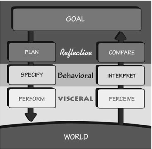
This section presents the theory required to delve into human subject research for HCI. It sheds light on how things came to be designed the way we see them today. It illustrates how good interfaces tend to be ‘invisible’, which might be attributed to the narrow gulfs of execution and evaluation. It moves on to formalize different models of users - processor, predictor and participant. It enlightens how context is a crucial factor when evaluating interfaces. It delves into psychology to establish working knowledge of human abilities (perception and cognition). It introduces some well established design principles and presents it in an aggregated and ready to consume format. Most of these are general ideas that extend beyond interaction with computers. We learnt how users inherently form mental models of the system they interact with and how design guides those models. it was interesting to learn the subtle distinction between slips and errors and how bad design can trigger frustration (learned helplessness). It formalizes some task analysis methods like GOMS and cognitive task analysis to break tasks or human thought process into smaller units, thus enabling optimization and better design. It sheds light on distributed cognition illustrated with the vivid example of how a cockpit remembers its speed. The cognitive load on the user can be shared with the overall system - computer interface or other individuals. This section is concluded with anecdotes of how designs have social and political effects and how it is sometimes leveraged to accomplish goals other than mere usability.

Methods
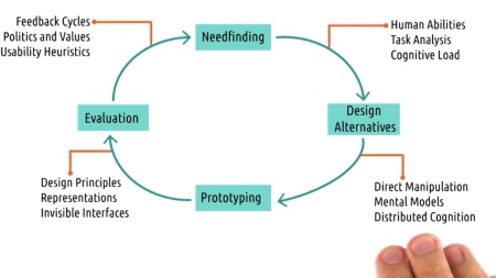
This section has a more practical touch to HCI. It starts off with the cautionary tales of unethical research, and how the benefits must outweigh the risks (CITI trainings too have the same underlying theme). It then walks us through the whole design lifecycle. It starts at the need-finding stage, where we gain insights as to what are the requirements that we want to meet for a design - What is it the user wants? It delves into the types of users, biases and some guidelines or tips for conducting surveys and interviews. This stage is followed by coming up with design alternatives - the more the merrier. It guides on how brainstorming sessions ca be conducted and how ideas can be merged. Once a handful of the design ideas are shortlisted, we move on to prototyping, generally starting with low fidelity. We learn about the different types of prototyping and when to use what. next we move on to evaluating the prototypes. There can be multiple cycles of prototyping and evaluation, and the evaluation is somewhat governed by the prototype available. While empirical evaluation provides conclusive results, qualitative and predictive evaluations have their place in the cycle. This section concludes by touching upon how to fit this design lifecycle into fast paced agile development.

The next two sections - Applications and Related Fields serves as a preview of what is currently going on in the field and what are the academic and career options one has after a deeper dive into the subject.
Though this course covers a lot of things, it is still safe to say that it just revels the tip of the iceberg.